Archive for May, 2009
Amazon’s Kindle: A case for accessible design
May 17th, 2009
Accessible design (also known as universal or inclusive design), is all about designing your products and services so they can be accessed and used by as wide an audience as possible, regardless of age, disability, or other limiting factors. It’s not about designing for a specific disability group, rather it is about making sure that mainstream products can still reach the growing number of people without perfect vision, hearing, mobility, or cognition.
Accessible design is more than just a social phenomenon – as the balance of the population continues to tip towards the elderly, it is increasingly being seen as a commercial opportunity. Those at the older end of the population pyramid often do not have the same levels of dexterity or eyesight as their younger counterparts, although they do have considerably more disposable income. Products that are designed to also meet the needs of this rapidly growing user group therefore have the potential to appeal to a considerably larger market.
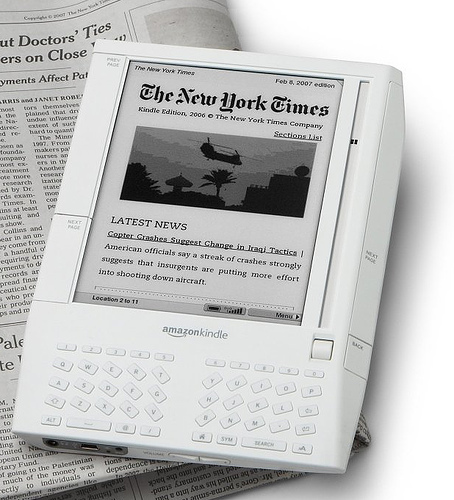
An interesting yet unexpected example of this came to light recently, when discussions on an Amazon forum led to the revelation that over 50% of Amazon Kindle owners are 50+, and nearly 70% are 40+. So why does the Kindle appeal so much to this older audience? Take a look at this quote from a Publishers Lunch report based on the same forum:
“So many users said they like Kindle because they suffer from some form of arthritis that multiple posters indicate that they do or do not have arthritis as a matter of course. A variety of other impairments, from weakening eyes and carpal-tunnel-like syndromes to more exotic disabilities dominate the purchase rationales of these posters.”
For those with arthritic hands, the form factor of the Kindle makes it easier to hold and easier to page through than heavy hardcovers and flimsy paperbacks. The display also offers several advantages. It uses an electronic ink that is similar to print, so it is crisp and clear. For those with ageing eyes, the text size is also customizable – providing obvious advantages over paper equivalents (this is also an important feature for those with dyslexia). As one legally blind Kindle owner explains, the text-to-speech functionality is also a very important accessibility feature – while the computerized voices are no competition for audio books, they are still progress towards making text more generally available to the visually impaired.
Of course, the Kindle doesn’t have it all figured out (for example, see some additional accessibility requests from Russ Stinehour). But it certainly is a great example of how taking an inclusive approach to the design of a mainstream product can benefit your users and customers in unexpected ways, and how it can also help you to reach a much broader and more lucrative market.
Tags: Accessibility, Accessible design, Inclusive design, Universal design
Posted in Design, Usability | Comments (0)
Axure for wireframes and interactive mockups?
May 9th, 2009
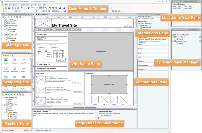
One of the companies I do user-centred design for invited me to join in on an informal demo of Axure this week, a tool for wireframing, building prototypes, and creating design specifications. The person leading the demo had been using a trial version of the software for about a month, and was so excited about it she was trying to convince her company to buy some licenses.
Here’s a screenshot of the tool:
Although I’ve never used Axure myself, I wanted to share a few thoughts I had based on the demo. Currently, I use Microsoft Visio to do most of my wireframing (low-fidelity and medium-fidelity), and when I need to show interaction (eg for user testing, presenting ideas to the project team, or demoing end-to-end scenarios) I’ve been using Microsoft Expressions Web to turn the designs into all-singing, all-dancing prototypes. I’ve been really happy with this process, and have found that the combination of Visio and Expressions has certainly been meeting my needs. But the woman who demoed Axure was so excited (after only a trial!), that I’m somewhat intrigued.
Based on the demo, I gather that some of the strengths of Axure are:
- Useful for quickly communicating and evaluating ideas that are tied to interaction
- Useful for documenting agreed designs, including the behaviour of each control/widget
- Useful for incrementally building up and documenting a design base (especially good for long term, iterative design projects)
- May be quicker (eg than MS Expressions) to create interactive mockups, such as those for user tests and demos?
However, the demo also left me wondering about a few things:
- It was not clear how well Axure serves as a primary design tool (eg in place of Visio), as it was not immediately obvious how well it facilitates ‘design exploration’ – in which case, base initial designs may still have to be roughly defined and agreed in a separate tool (eg Visio) before being moved over to Axure.
- Because of its focus on interactivity, I have some concerns that it may encourage defining detailed interactions too soon in the design process.
I’m considering downloading a trial version to play around with, its just a matter of finding some ‘free’ time. In the meantime, I’m curious if any of you have used Axure? I’d love to hear about your experiences with it, or with other similar tools!
Tags: Design tools, Interaction design, User interface design
Posted in Design | Comments (0)
The importance of setting sensible defaults
May 3rd, 2009
Or, when did ordering tea become so complex?
Have you ever tried to accomplish what you expected to be a straightforward task, but been sidelined because there were too many steps or too many choices to make? This is a common problem in web and software design, but you have probably also come across it in many other day-to-day tasks. For example, this is what happened to me when I tried to order a tea at Starbucks recently:
Me: Hi, can I have a medium tea for take-away?
Starbucks Guy: Ok, one tea. What size would you like?
Me: Medium, please
Starbucks Guy: One medium tea. To drink in, or to take away?
Me: To take away please
Starbucks Guy: Ok
[Starbucks Guy turns around and walks over to the tea bags]
Starbucks Guy [calling over his shoulder]: Would you like one tea bag or two?
Me [yelling back to him over the general coffee shop noise]: One is fine!
Starbucks Guy [still calling over his shoulder]: Is English Breakfast ok?
Me: Yes! English Breakfast!
Starbucks Guy [now standing by the hot water spout]: Would you like room for milk?
Me: Yes, please
Starbucks Guy [now standing back at the counter]: Warm milk, or cold milk?
Me: Cold milk is fine
Starbucks Guy: Ok, cold milk is on the counter next to the napkins
[Starbucks Guy finally hands me my boring old standard cup of tea, so I can go add my boring old regular milk]
In this situation, I asked for a medium tea for take-away, thinking that would be more than enough information for the cashier to prepare my order. I didn’t want anything out of the ordinary, yet he still had to ask me SIX questions before the order was complete; two of the questions repeated information I had already provided, and none involved up-selling.
Now, I understand that one of Starbucks’ defining features is that it allows each customer to personalise their order to fit their unique tastes. But when carrying out common procedres like placing a tea order or installing a new software product, there is likely to be a large portion of the population who want or need basically the same thing, and a smaller portion of the population who want or need something dramatically different. This is why, in user interface design, we try to define sensible ‘default settings’ whenever possible – it makes life easier for the majority of users, and makes processes more efficient.
In the world of software, a default or preset is an initial value that is assigned to a configurable option. Likewise, default options often exist in the physical world; for the configurable option of ‘number of tea bags’, most cafés have a default value of ‘one’. The goal is to identify the values that will meet the needs of most users or customers, so the majority of people don’t have to bother thinking about what the ‘right’ answer is.**
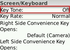
For example, on my Blackberry Pearl, the default setting for the ‘Key Tone’ (the sound that is made when you press a key) is ‘Off’ – most users don’t want to hear a beep every time they press a button on their phone, so they will simply accept this perfectly reasonable default setting. However, for those who need more feedback that a key has been pressed (such as people with vision impairments), they can change the setting to meet their needs:
How can we extend this notion to other real-world processes, like filling a drink order? Simple.
- For each drink type (tea, café latte, cappuccino, etc) collect some data on what people order and what options they choose (size, milk type, topping, etc)
- Identify the most common configurations
- Establish those common configurations as the ‘defaults’
- Allow your customers to indicate any special requests up front, but don’t force them to reiterate the standard options unnecessarily.
Of course, you can’t set default values for everything. For example, you couldn’t set the default drink type to ‘tea’ at Starbucks – there are some choices that customers just have to specify, and defaults are only useful if they are carefully chosen to cover the majority of cases. But whether you’re designing the process behind a web application, a mobile phone, or a face-to-face interaction, think carefully about the defaults so you can optimise the end user experience.
** Note: I am not advocating for designing for the ‘average user’ here. I am suggesting that if you have decided that there is value in making something customisable, you should still make every effort to minimise the need for users to interact with that configuration.
Tags: Efficiency, Optimisation, Process design, Service Design, User interface design
Posted in Usability | Comments (0)


