Archive for June, 2009
Usability job titles: What is it you do again?
June 29th, 2009
Russell Wilson recently posted results from a survey of UX/UI professionals, which asked them to rank their preferred job titles. The results showed that ‘User Experience’ was the most preferred prefix, and ‘Designer’ was the most preferred suffix. Russell also pointed out the ambiguity of the term ‘User Experience’, and questioned its longevity as a title term since it is so often misunderstood both within and outside the UX/UI profession.
I think it is interesting to look at what we as professionals think we should be called, but I think it would be even more interesting (and useful) to understand what titles those outside our field expect us to have. Who do they look to contact when they are seeking out our services? What job titles do they search for, and what titles most effectively communicate what we do?
After all, as people who specialize in making sure that products and services are consumable and meet the needs of those who use them, shouldn’t we also make sure that what we ourselves offer is easy to understand and consume? I personally think what we call ourselves is an important part of this, and probably deserves some research in its own right.
Tags: Job titles, Usability, User Experience
Posted in Usability | Comments (0)
Fun with Windows Mobile Error Messages
June 28th, 2009
Just before I started working at my current company, they decided to invest in smart phones for their consultants. A great idea, but unfortunately we all ended up with Windows Mobile devices which have pretty much been a nightmare from day one, and which we now refer to as ‘the brick’. While there are many problems with the phone from a usability and user experience point of view, I thought I’d share one of my favourite examples.
After dialing a number or choosing a contact that you’d like to call, sometimes the call fails for no apparent reason, and this message pops up onto the screen:
“Cannot connect. Ensure that your phone is turned on and correctly configured, and that service is available, before trying again.”
The message is unhelpful for so many reasons, especially the part that states “Ensure that your phone is turned on”. Ahem. If my phone wasn’t on, how would I be reading this message, exactly?
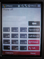
To make matters worse, if you switch to the phone display it shows the text “Phone off” at the top:
Hm. I’m pretty sure that the phone is on, unless this whole experience is a hallucination.
The first time I had this problem it took me ages to figure out what the messages were trying to tell me, and to figure out how to turn the phone ‘on’ even though as far as I could tell the phone was already on. Apparently the people who designed the UI had a different notion of what constituted the ‘phone’ versus the device itself – the device could be turned on while the phone function was turned off, and hence the ridiculously confusing error message.
This is a great example of how things can go terribly wrong when the designers’ mental models, or ideas about how something works, do not match the user’s. It is also a great example of a significant usability issue that could have (and should have!) been detected well before the device went to market, if sufficient user research and testing had been conducted.
Tags: Error messages, Usability, User interface design
Posted in Errors and Error Messages, Mobile, Usability | Comments (3)

